
Dexter S06E09 and Email: find the 7 mistakes
I’m a longtime fan of Dexter (the TV series).
I’ve also been doing some research on Email, particularly on usages and user interfaces (UI).
But it actually does not require any strong background in Email, just being a regular Email user, to understand that during Season 6 Episode 9 (S06E09), the scenarists (or whoever is in charge of the set of the series) have down a terrible job in designing the Email interface that Travis Marshall is using to reply to a blog post from “Doomsday Adam”.
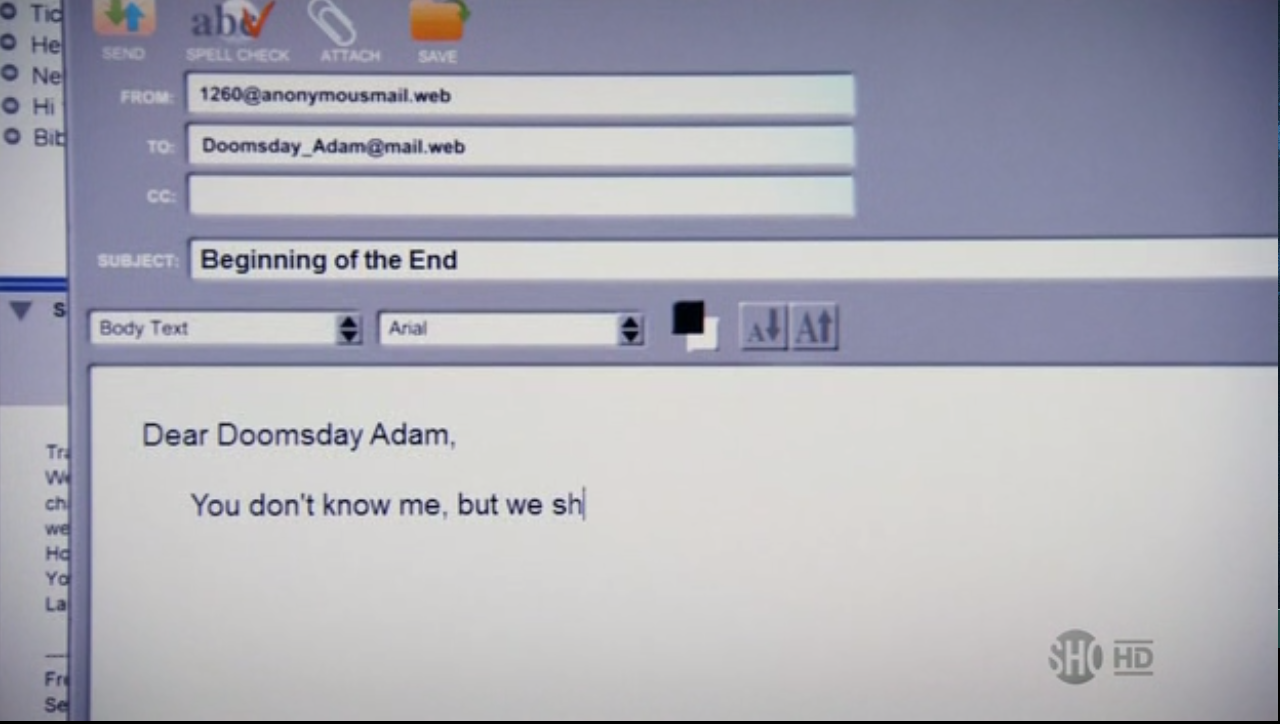
Look at the crime scene (image below, click to enlarge). It has been captured at 00:10:30 in the episode. This image may hurt the sensibility of any UI designer.
Find the 7 mistakes!
</p>

Before giving my answer, I am just wondering: how is it possible to make so many design mistakes in one single interface? Email clients are widely spread, they exist plenty of those for absolutely any single Operating System. So it's not difficult to use any (or at least to copy) and it would be a good product placement. And nearly EVERYBODY uses Email, so making a bad copy would be noticed by many (like a fake care or toaster would be noticed).
Anyway, my asnwer..
My top 7 mistakes:
</p>
- Send button is never a double-way arrow. Uusually one way, the other one is on the button to check/receive Emails.
- Dot web (.web) is not a standard Internet top-level domain extension. Email is not even the web, it is the Internet. Email was created in circa 1971, way before the WWW.
- From is never a plain text field. But a selection among pre-configured accounts.
- Size-limited "From:" / "To:" / "CC:" /.. text field. Why making them so small in width? At least make the subject field as large, just for interface consitancy.
- Limited number of recipient. You can usually add more "cc:" or "to:" which does not seem to be allowed in this case.
- What about BCC?
- Missing advanced text formatting. Multiple fonts are provided, but no italic, bold, smiley, or whatever advanced formatting should be there if you allow multiple fonts.
</p>
</p>
</p>
</p>

</p>
</p>
Alternative titles for this blog post
- Dexter and Email: Yet Another Crime Scene
- RFC 822: Dexter’s Next Victim